Dev-Ready UX/UI for a Streaming App
Design System, Component Library and Implementation-Ready Handoff for External Development Teams
Designing the WELT TV mobile app meant structuring a complex streaming product rather than simply designing screens. The app combines documentaries, series, news clips and live broadcasts within a single platform, while also integrating editorial logic, brand requirements and monetization features such as Plus access and paywall elements.
From the beginning, the focus of the project was to create a system that external development teams could implement without ambiguity. Instead of treating each screen as a standalone layout, the product was designed as a structured UX architecture that defines how content, components and navigation behave across devices.
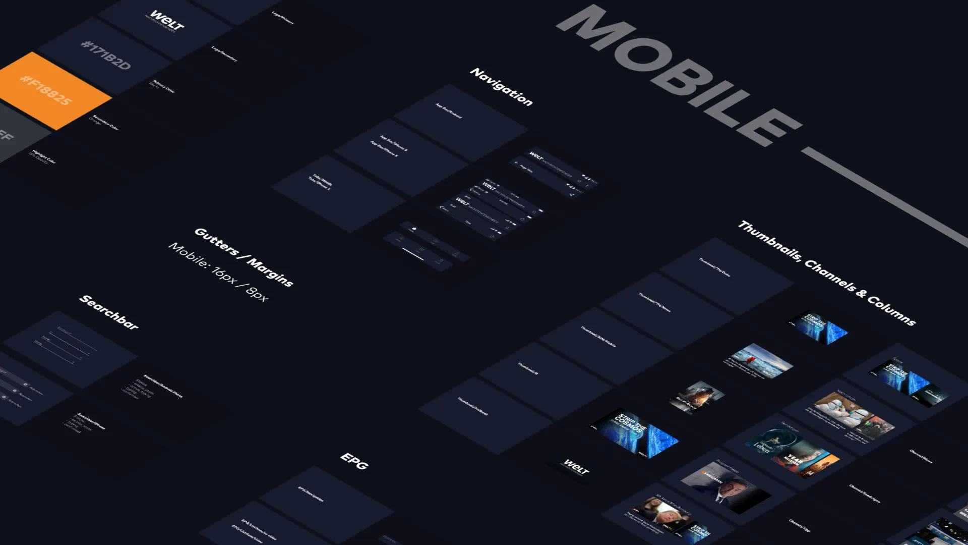
The foundation of the project was a documented design system that structured the visual language and interaction patterns of the app. Rather than designing isolated layouts, UI elements were organized into reusable components and states that could scale across the entire product.
Blartz
#171B2D
23,27,45
Orange
#F18825
241,136,37
Blartz
#171B2D
23,27,45
Orange
#F18825
241,136,37
Background
#0E101B
14,16,27
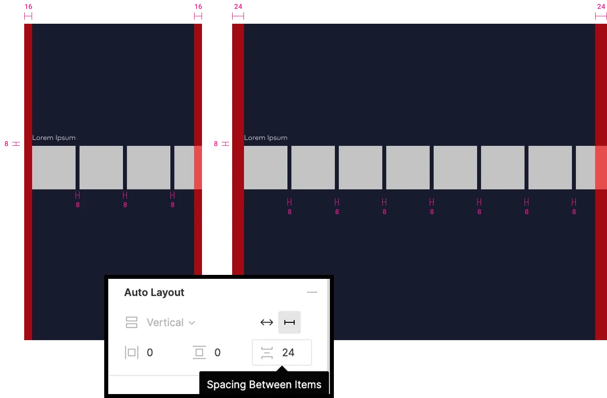
- 01Brand-aligned color, typography and spacing systems
- 02Navigation patterns adapted to both iOS and Android conventions
- 03Defined component states such as loading, empty and error conditions
- 04Responsive rules for phone and tablet layouts, portrait and landscape
- 05Consistent media teaser and thumbnail hierarchies for editorial content
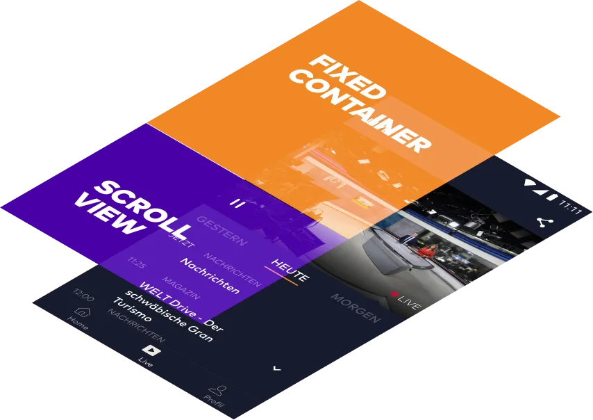
Beyond the visual system, the project included a detailed screen-by-screen specification describing how the interface behaves in real scenarios. These notes document logic that cannot be derived from static UI layouts.
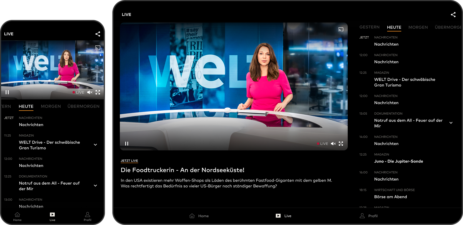
- 01Home screen with editorial highlights and program navigation
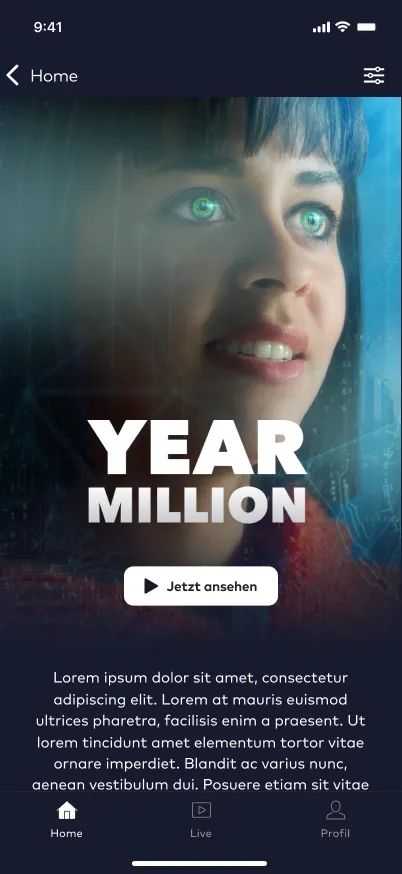
- 02Video detail pages for shows, series and news segments
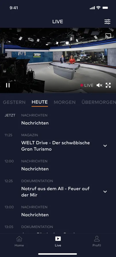
- 03Streaming player with live and on-demand video
- 04Live broadcast section including EPG integration
- 05Authentication, account and profile flows
- 06Settings, notifications and platform-specific variations
Together with a component library containing more than one hundred component states and a device matrix covering phones and tablets across both platforms, the product became a coherent UI system rather than a collection of layouts.
Stakeholders from marketing, editorial, brand and management were involved throughout the process. User flows were mapped and reviewed iteratively to ensure that not only the visuals but also the structure and navigation of the product worked reliably.
The final deliverable was a structured package of components, rules and screen specifications that allowed the external development team to start implementation quickly and with minimal ambiguity.
Instead of handing over design files, the project translated the product into a system developers could build with confidence.