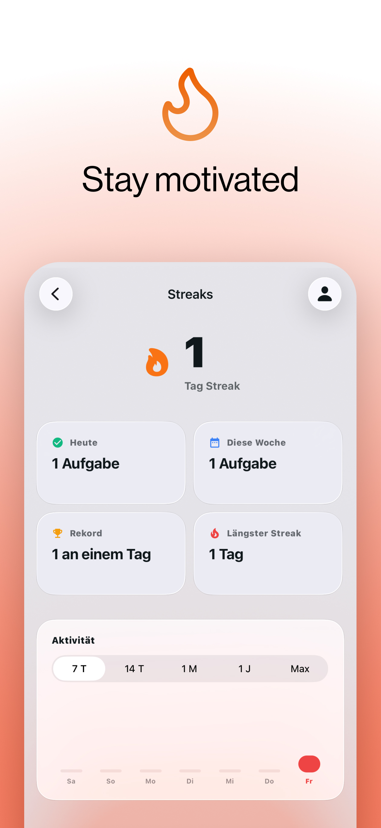
Building habits with Streaks
Reminders+ is a local-first habit & task app for iOS
Some productivity apps are too good at letting you plan. You end up with perfect lists… and zero momentum.
Reminders+ is my attempt to fix that with one simple rule: do at least one thing every day — and let the streak do the heavy lifting. It’s a clean, fast, local-first iOS app we designed together with Max Möckel and built in React Native. App Store
Instead of pushing you into huge lists, Reminders+ is intentionally built around consistency:
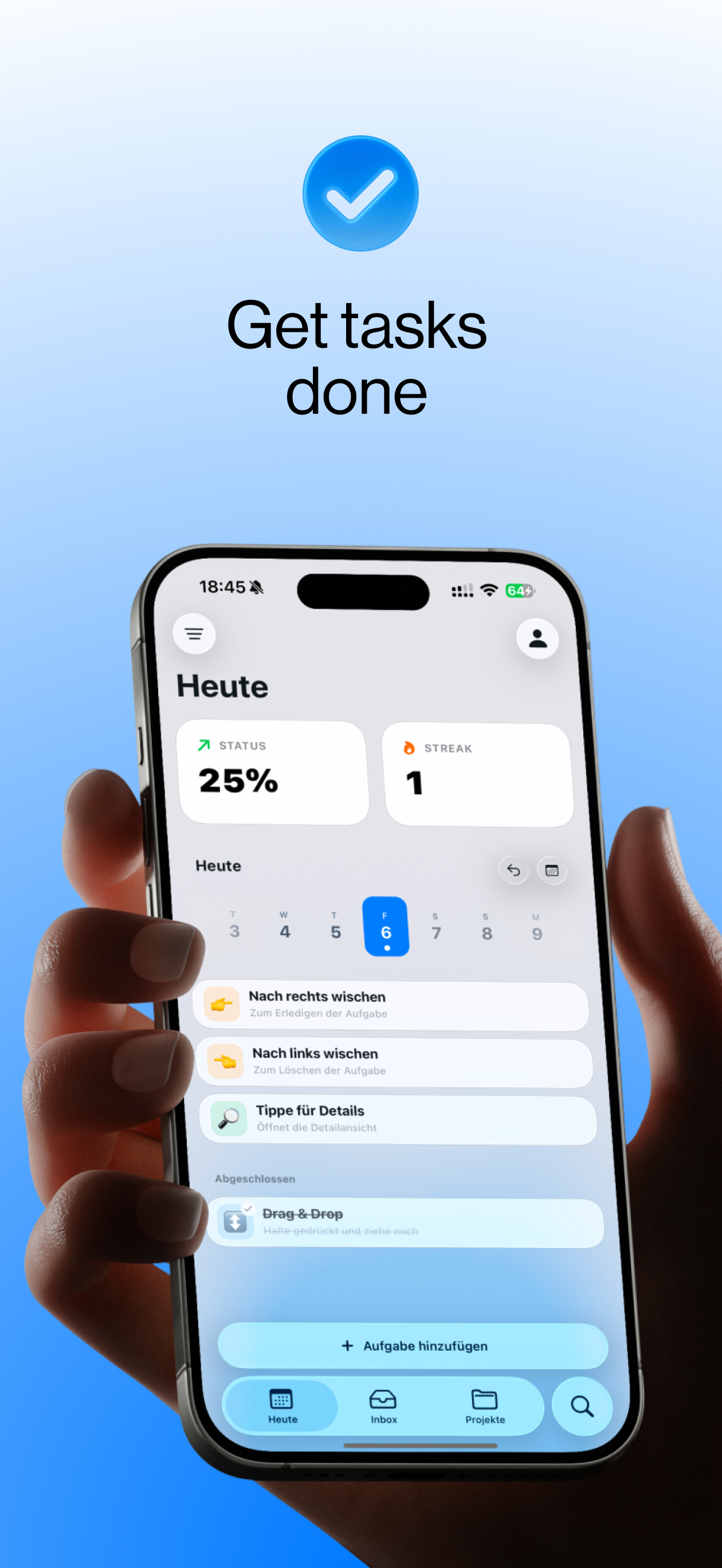
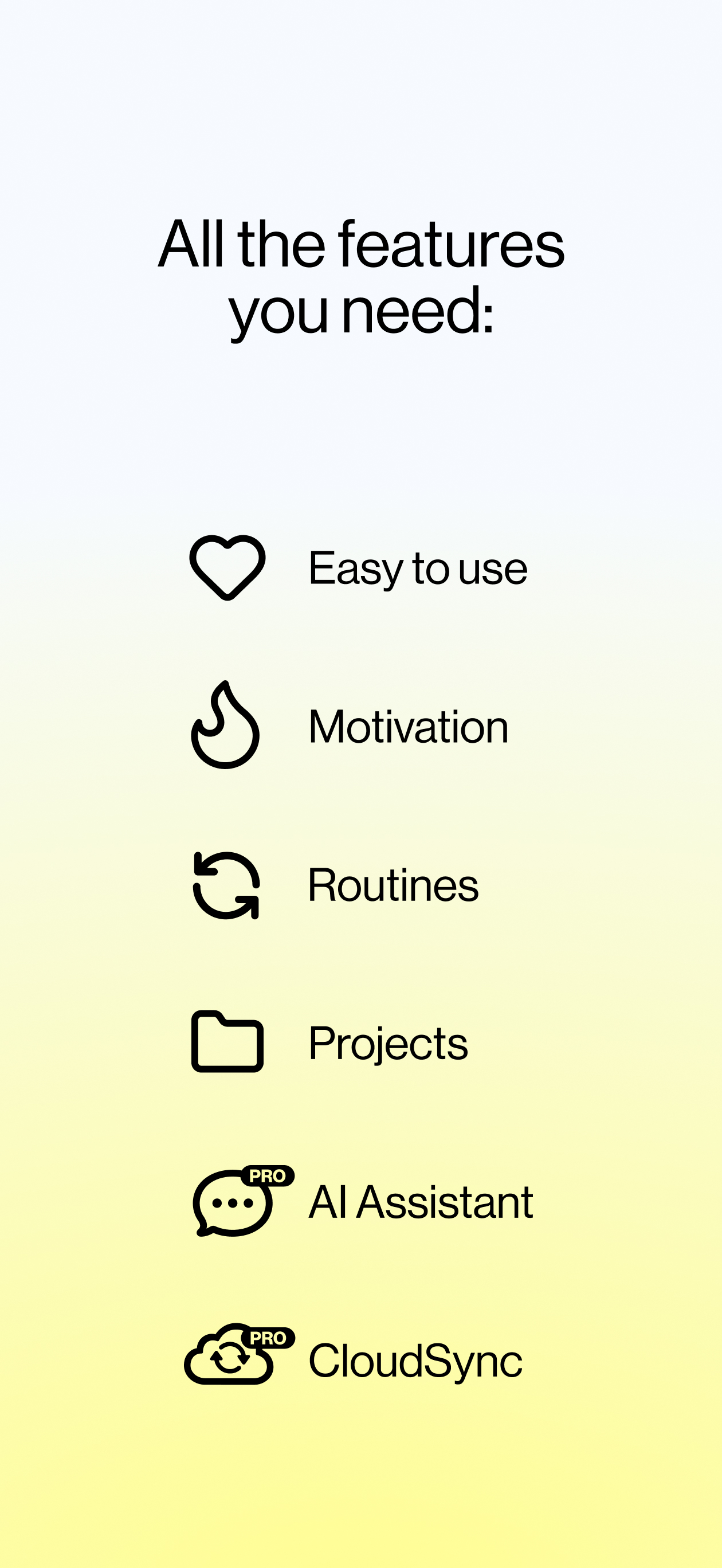
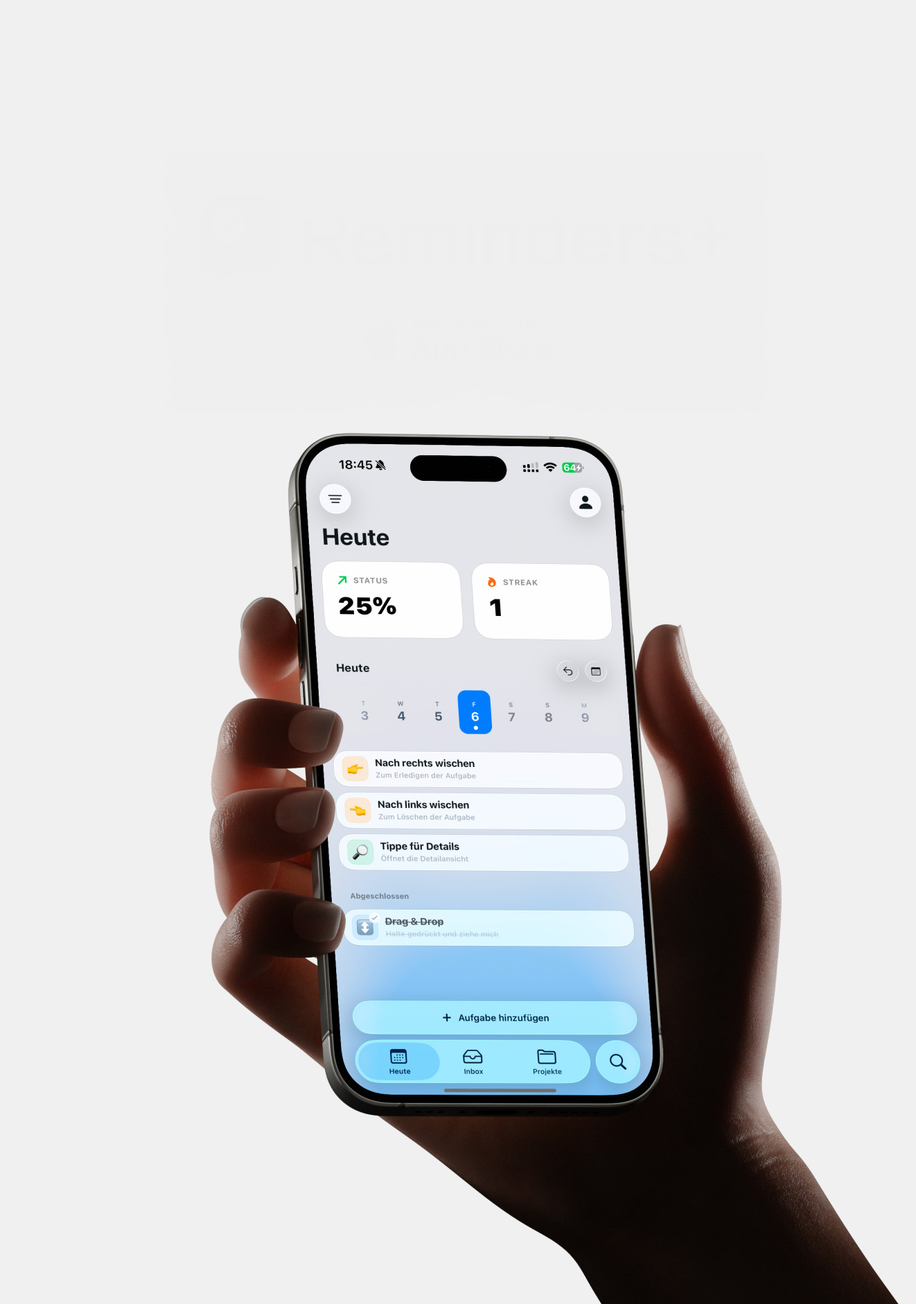
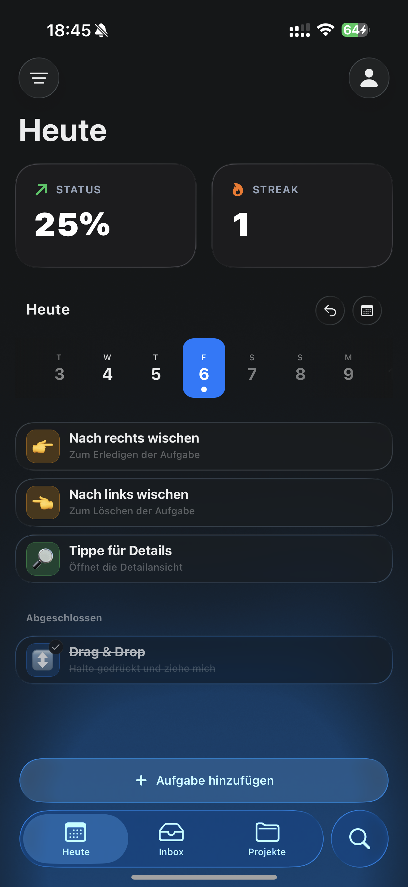
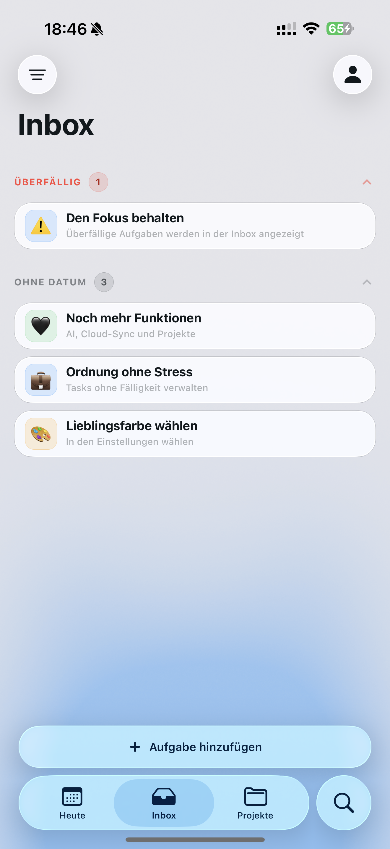
- 01Tasks for the stuff you need to get done
- 02Routines for habits (daily / weekly / monthly)
- 03Projects for bigger goals
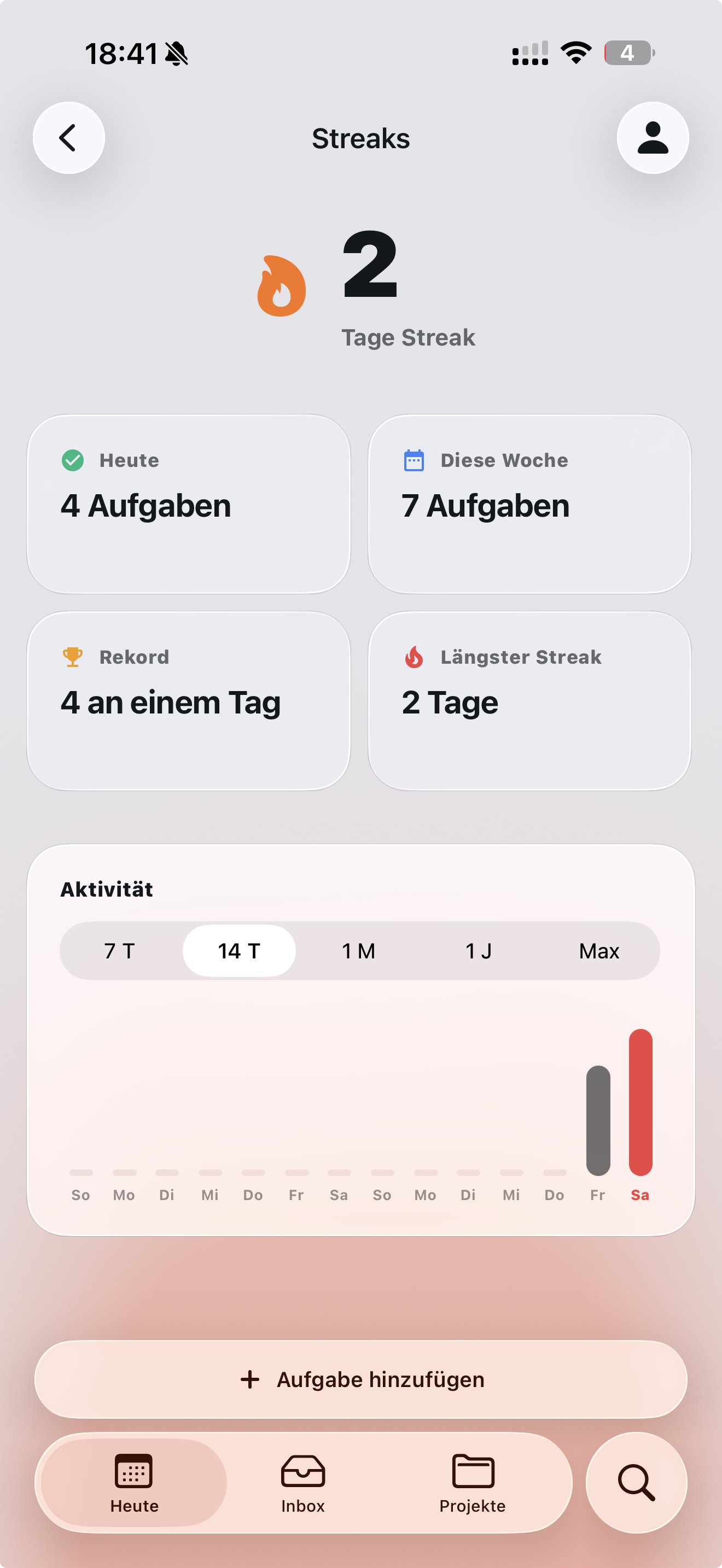
- 04Streaks as the motivator — your progress stays visible and tangible
That mechanic sounds small, but it changes how you use the app: you stop aiming for “finish everything” and start aiming for “show up today”.
We designed Reminders+ around a few principles:
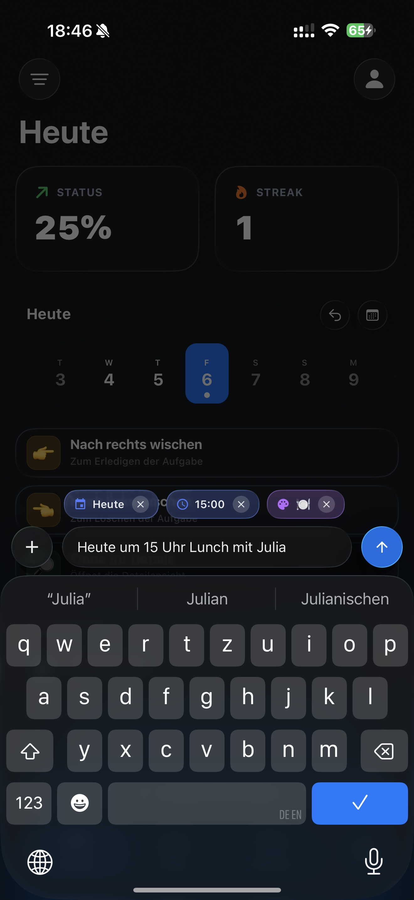
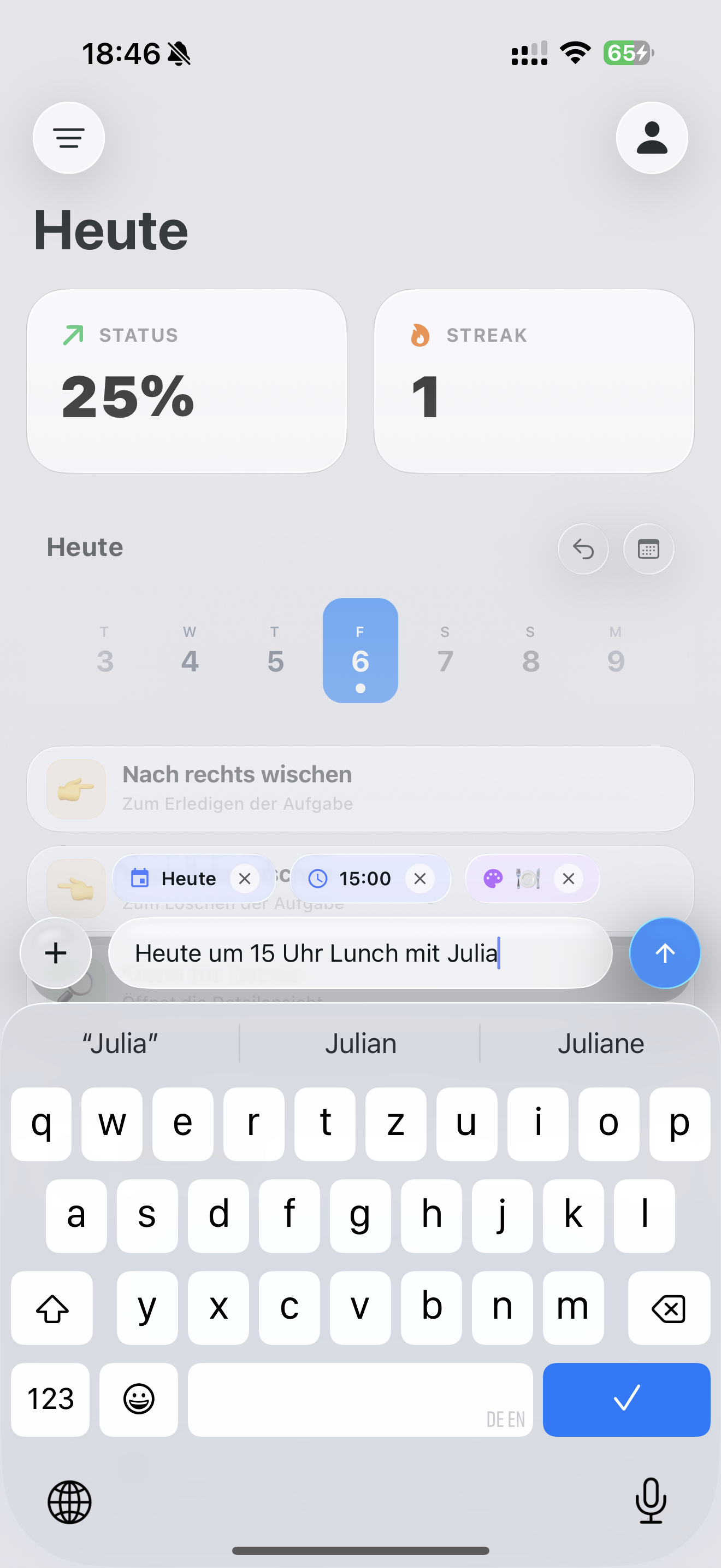
- 01Fast capture (getting a task in should never feel like work)
- 02Clear hierarchy between Tasks / Routines / Projects
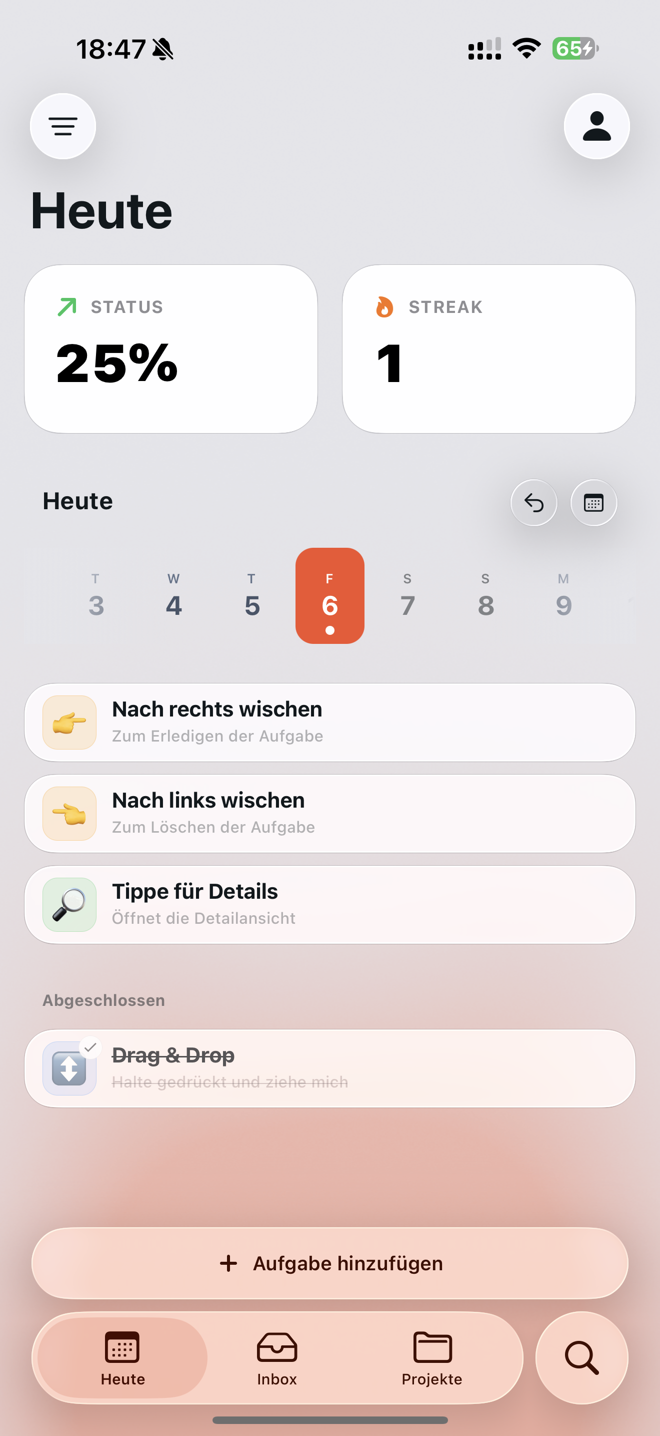
- 03A UI that stays out of the way, so your attention stays on doing, not organizing
So Reminders+ is built on React Native and local-first by design:
- 01100% local storage, no cloud dependency
- 02“Data not collected” (App Store privacy)
- 03Fast & lightweight, with smooth navigation and animations
iOS-Blue
#007EFF
0,126,255
Red
#F4512C
244,81,44
Off-White
#F5F7FA
245,247,250
Ink
#0B1220
11,18,32
iOS-Blue
#007EFF
0,126,255
Red
#F4512C
244,81,44
Off-White
#F5F7FA
245,247,250
Ink
#0B1220
11,18,32
Orange
#F97316
249,115,22
Green
#22C55E
34,197,94
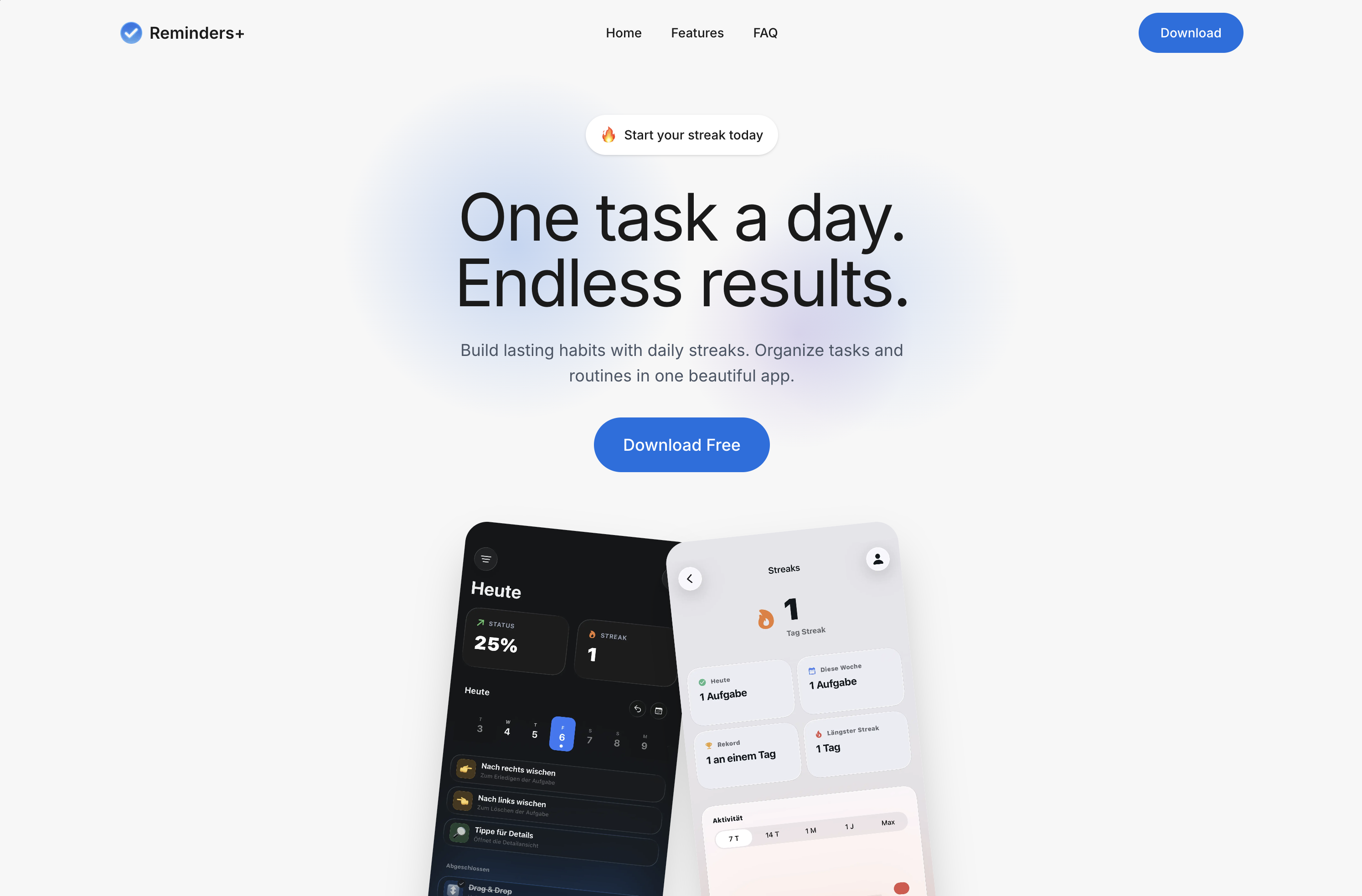
The landing page serves as a visual extension of the app's minimalist philosophy. It was designed to communicate the value of privacy and simplicity immediately, using clean layouts and interactive previews to demonstrate the fluid navigation and the "no-account-required" onboarding flow. Visit the landing page and download in the App Store.